Accessible Design | Hardware Product Design | User-Centered Design
Cicerone
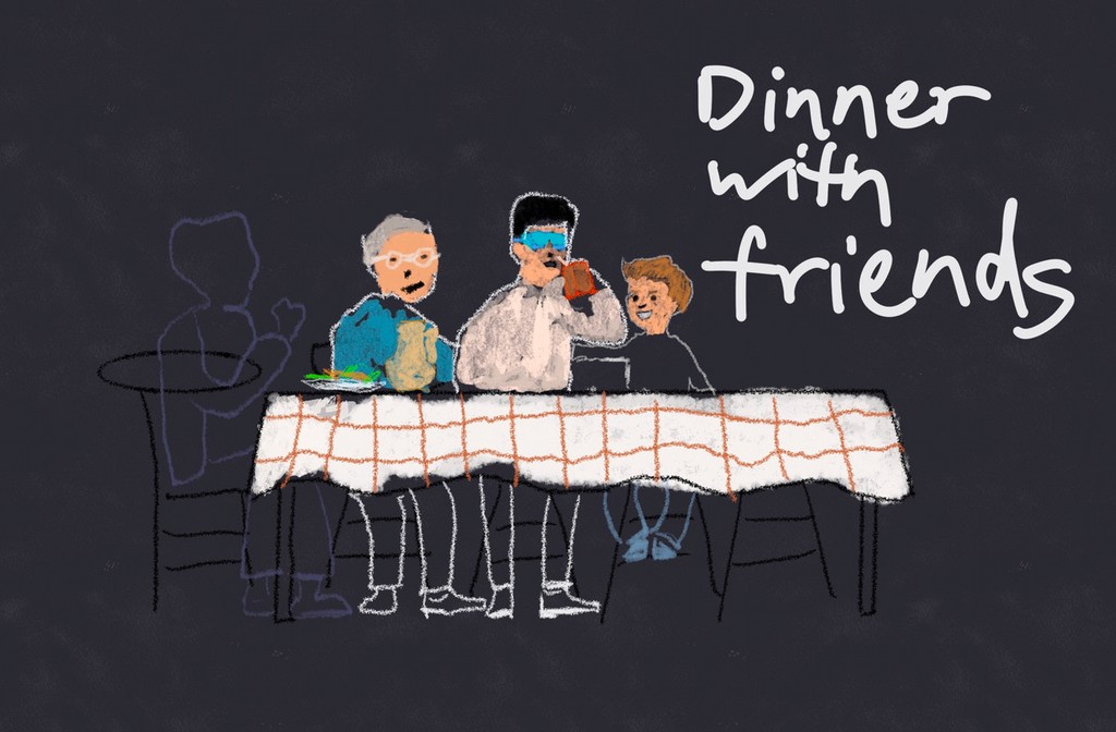
Cicerone is an AI-enabled haptic wearable navigation wayfinder headset prototype that helps blind and visually impaired individuals to walk in straight lines effortlessly and to reach destinations independently
Role: Lead Prototyper, Product Designer
Duration: 3 months
Project Type: User-Centered Design Class Project at UW
Watch Final Solution Video
01
project overview
The Problem
“How can we facilitate those with visual impairments or blindness to navigate their preferred routes efficiently and engage seamlessly with their social circles?”
—
Project Summary
Cicerone is a class project for the User-Centred Design course at UW's Human Centered Design & Engineering program.
The prompt for this project is "Back to a Future Life Together,"which asked us to design a non-app or website that enables people to "do life together."
The team conducted the work in Seattle, WA, and there were several participants from other states and overseas.

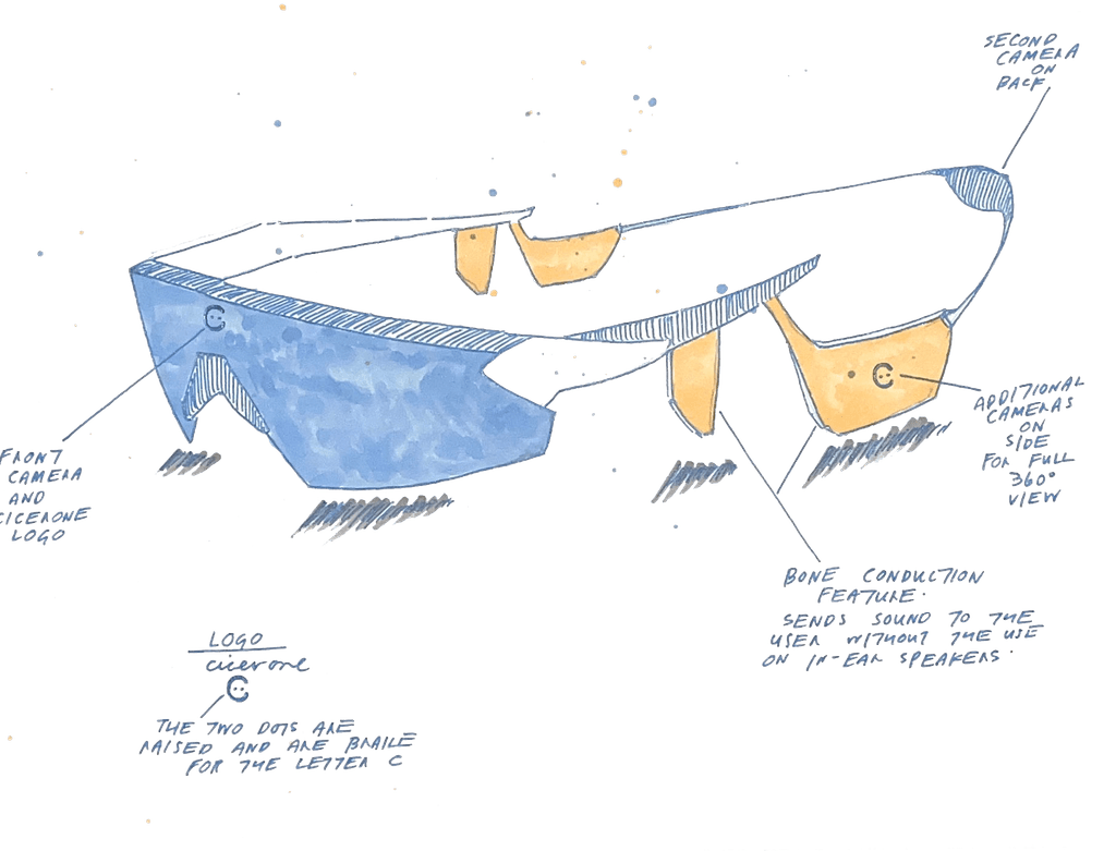
Cicerone uses a LiDAR system to scan the surrounding environment and deploys auditory + haptic feedback to help blind or low-vision users to walk on stairs more safely and confidently.
—
Solution
Our team designed a "Wizard of Oz" high-fidelity prototype powered by a bone-conduction headphone, a tablet-controlled MIDI controller, a set of wireless lavalier microphones, and an artificial intelligence human simulation.
The system is complementary to the existing assistive tools like white cane, online maps app, and accessibility features that are built-in modern smartphones.

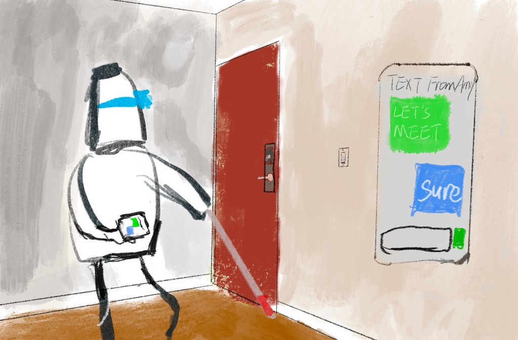
Cicerone uses an AI-powered camera that reads text on the objects when the user request by voice.
—
Stakeholders
Our primary users are blind and visually impaired individuals.
We also explored how service dogs, helpers, people on the street, and video call services (Aira / Be My Eyes) can be potential stakeholders for our design.

Cicerone uses haptic feedback to keep users on their desired path, notify users of the obstacles ahead, and provide detour guidance.
Let’s talk about numbers
100%
of participants mentioned they do find auditory (sound) notifications can get annoying sometimes.
#6
On average, each participant has tried or currently using 6 types of analog or assistive devices in their daily lives.
02
user research
02
user research
Research Methods
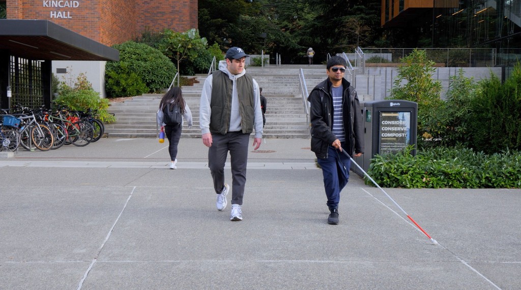
Narrative research on UW Seattle Campus with blind participant

Survey
We had a variety of questions ranging from the tools blind individuals use to navigate their path to the elements in their navigation journey that cause hassles.

Interview
Get a deeper understanding of the issues that the survey respondents mentioned.

Narrative
Closely observe our participant’s actions as they went about navigating their path.

Co-design sessions
Cicerone hosted 2 co-design design sessions a blind individual, and this process made sure Cicerone's solution is designed with the users' routine in mind.
Research Findings
-
Haptic Feedback
All participants mentioned that current tools lack haptic feedback.

-
"Last mile" problem
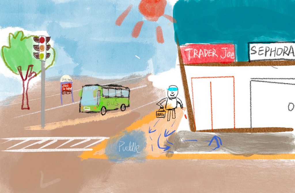
All participants mentioned that current navigation tools do not provide granular details such as distinguishing between two storefronts or the exact room one wants to enter.

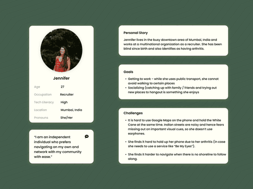
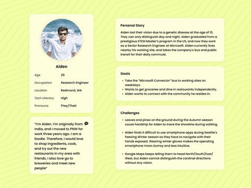
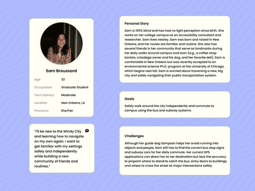
Personas
Background
Emerged from interviews and narrative research. We designed our device to help users throughout their daily lives while prioritizing their safety.
Although we examined the goal and role-directed desires for each of our fictional personas, we also humanized them.
We would often refer back to them and ask ourselves, "what would Sam think of this new iteration? This still helps her on her way to school, right?"
Constraints
Our recruitment pool of individuals who are blind and low-vision was small. Therefore, our fictional personas became the foundation of our user research.
Their fictional scenarios continually helped us iterate new ideas when we did not have in-person testers.
However, this also limited our scope, and our personas closely resembled our interviewees and user testers.
Research Goal
Leveraging various methodologies to learn about user's painpoints, needs, and translate insights into design opprtunities.
Design sketches
—
What goal we want to achieve with our solution
Remain low intrusion & interference in user's daily life, and complemental to an existing assistive technology
Provide the safest path, not the quickest
Provide haptic feedback for obstacles
Include an accurate turn-by-turn direction guidance, especially for last-mile navigation and spaces where there is no shoreline (such as edge of sidewalk) to follow
Take the impact of noise levels in outdoor environments into consideration, so that user can hear the guidance clearly regardless the using environment

03
ideate, design & prototype
Sketching out scenarios before prototyping
Visualize and communicate how users could interact with the product in a real-world context.
User-Centered Understanding – By sketching out the scenarios, designers in the team could step into users' shoes. Especially in this case, designers try to understand blind people's needs, pain points, and goals more in-depth within a specific context.
Problem Framing – Identify friction points, inefficiencies, or gaps in the user journey that need to be addressed.
Design Validation – Sketching scenarios allows us to test our assumptions align with actual user behaviors before investing in higher-fidelity prototyping and followup testings.
Usability Testing Preparation – Scenarios inform usability testing by providing realistic contexts and tasks that users can perform.
How should the users interact with our design?


no $$$, no emerging tech, under tight timeframe
How did I prototype a future technology MVP

Spatial Audio Mapping + Haptics Simulation
Lead Prototyper Dave uses audio editing software to map out and adjust the spatial stereo-auditorial feedback that includes the simulation of haptic signal.
By using spatial audio mapping, test participants can fairly accurately identify the direction & distance of an event relative to their real-time position. The sound’s loudness and frequency will adjust in response to where the user movement, and once they move past the event, they receive immediate feedback to confirm their progress.

MIDI Controller as Remote Control Interface
Dave exports audios and haptic patterns to an iPad MIDI Controller app, "Launchpad", and customize the cues attributes such as loudness, stereo channel, and surrounding effects to fit testing participants' preferences.
All the sound are on Launchpad interface for different tasks, the facilitator in team will cue corresponding auditorial feedback when user encounters obstacles during the test. When the facilitator cues the sound, the test participant will hear corresponding sound & haptic simulation.

Human act as AI substitute
Due to the tech and time constraints, the team were unable to integrate an real-time AI assistant with LiDAR, so one of our team members is "disguised" as an AI to provide feedback through the bone-conduction headphone in supplemental to the minimalized haptic & auditoial signals.

Bone-conduction headphone
To achieve an experience closer to the intended design, Dave chooses to use bone-conduction headphones in the prototype for sound transmission and haptic simulation, allowing users to communicate with the product during testing, while keeping both ears open to maintain a high-level of environmental awareness. Bone conduction headphones use resonance to deliver sound—making them especially well-suited for the simulated haptic feedback built into the design.
A glance of Cicerone
"Wizard of Oz"
prototype


How did we make it work?

04
usability test & iterations
How did we test Cicerone with low-vision & blind users

Indoor navigation in a hallway with a low-vision participant
Tasks:
Shoreline keep assist
Detour an obstacle on road
Text recognition: vending machine and door sign

Controlled outdoor navigation in an apartment courtyard with a blind participant
Tasks:
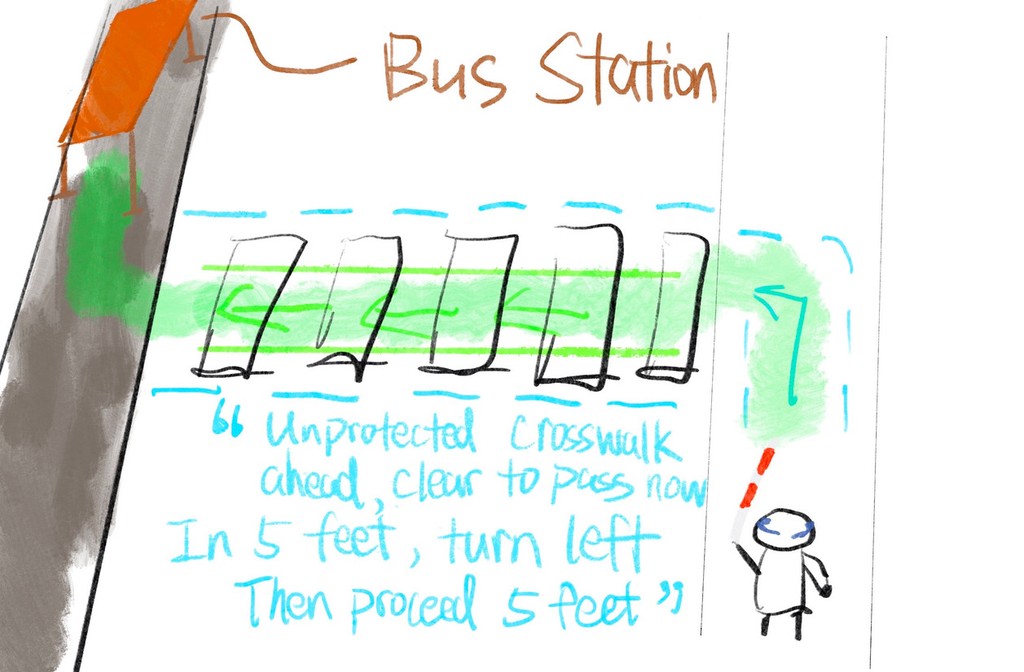
Turn-by-turn guidance in an unfamiliar and complex environment
Emergency hazard alert
Description of human beings and objects
Public transit simulation
Virtual shoreline guidance in an wide-open space with lane departurte alert

Semi-controlled indoor multiple-level navigation with a blind individual
Tasks:
Stairs guidance
Door knob locating assistance
Object detection
Detour obstacles
Door sign and keypad lock assistance
What does the usability tests tell us?
User feedback
Iterations
Give users more autonomy and agency when they want their surroundings to be described or announced.
Minimalizing the delay & response time between users' actions and the device to make the experience more intuitive.
Incorporating a greater variety of auditorial and haptic patterns while making them distinctive.
Simplify the device setup process and provide a "learner mode" that provides words with auditorial & haptic feedbacks.
Reduce the reliance on the internet. The product should be able to function by itself with the camera & Li-dar system.
“My white cane can get the job done 80% of the time, and I hope it chimes only when something special happen.”
“After I followed its instruction, it (Cicerone) took a second to give me the next move, but I like it tells me that I have successfully detoured on something.”
“I feel the sound is a bit monotonous and could irritate me if it keeps beeping at me”
"At the first 2-minutes, I am not exactly sure what each cue is telling me to do"
"I hope this works without network, cuz 'Be My Eyes' (app) always drops indoor when I have a bad cellular signal."
The team iterated the product based on all the feedback received, and testted the product with same group of participants again in a different environment.
What do our testers said about Cicerone

"I think there was a drastic difference between your first version and the latest version, it just make the experience so much more smoother".
— Blind user tester "Aiden"

"I cannot wait to have this device if it is available on the market. I can put myself on 'autopilot' mode with it and it definitely gives me a peace of mind when walking in a complex environment."
— Low vision user tester "Steve"
05
reflection
—
What could be done differently?
Bridge the research insights and design more cohesively.
In the usability test, test more scenarios and add more challenging tasks.
Research on the difference of low-vision, visually impaired and blind users' using patterns.
Keep engaging with study participants to understand their daily lives more in-depth.
—
Limitations
Due to the time constraints, the team was not ablr to test the design efficientcy in a more complex, real-world situations that users might have troble of hearing certain feedbacks.
The haptic in the prototype is a simulation with vibrating sound + bone-conduction sound transmitting, the team is unsure about how users might react differently to the real haptic feedbacks.
All the "AI" features in the prototype remains "Wizard of Oz" (human-acting AI) when study was conducted (late 2022), the team is excited to explore more with the rapid development of "real AI" with visual recognition available since 2024 could be utilized in accessibility field like Cicerone.
made in Seattle with ❤️

